ART BY DESIGN
An interior designer finds the
right moment to exercise her
gifts as an artist
Patricia Gray Interior Design | Fine Art
Patricia Gray Interior Design | Fine Art
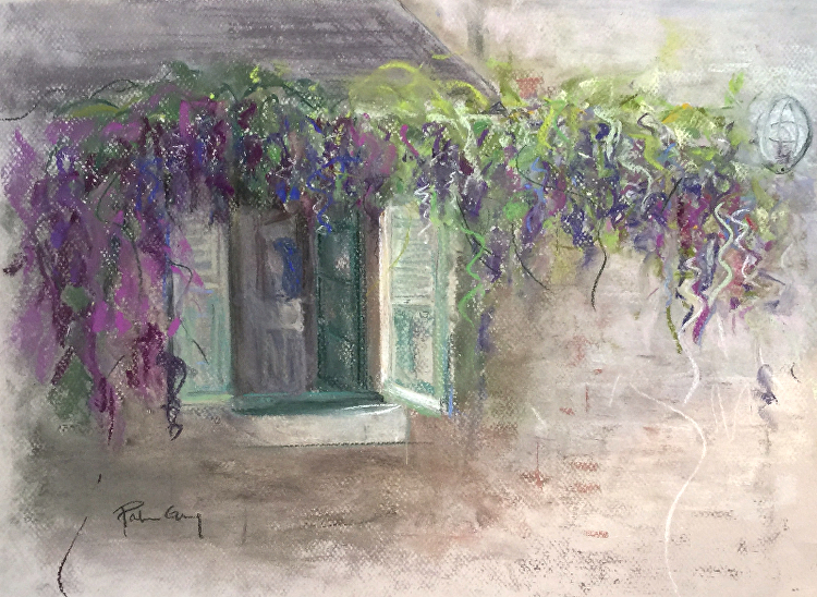
Patricia Gray has made a name for herself as an interior designer in Vancouver, building a career and reputation over a 40-year span. Casting an artist’s eye on kitchens, family rooms and entire homes, she has created living spaces that are works of style and function.
And with the tools of her craft – colours, fabrics and furniture – she has used three-dimensional spaces as her canvasses.
She sells her work internationally, as well as through her website (www.patriciagrayart.com), to her interior design clients, and through other interior designers and architects.
Today, some of Gray’s design clients have collected seven or eight pieces of her artwork in their homes.
She acquires much of the inspiration for her pieces from her travels. A trip to Desolation Sound along the north coast of British Columbia, for instance, provoked and influenced some of her work. She attempted to capture the feelings that were stirred by the depth and luminosity of the water in this remote and pristine location.
Owning original artwork is something everyone should experience, Gray says. “It’s an investment in your life and your lifestyle. It enriches your surroundings. Original art can be looked at over and over and over again. You get so much more energy and vibration from it. It’s an acquired taste, something everyone should experience.”


Indigo on Silver Leaf
To read the full article: Vancouver Home Magazine
2018 © Patricia Gray | Interior Design Blog™